Key Takeaways for 2026 Signage Trends
- High-Contrast and Glare-Free: New global standards prioritize matte finishes and high-contrast color pairings to combat age-related vision changes.
- Universal Symbolism: Information is shifting from text-heavy boards to intuitive, standardized iconography to bridge language and cognitive barriers.
- Contextual Placement: Signs are being moved to “decision-point” heights—usually 1.2 to 1.5 meters—to ensure visibility for those using mobility aids or seated in wheelchairs.
By 2026, the way we navigate our cities is undergoing a quiet but profound transformation. As global populations age, urban planners and transport authorities are moving away from “one-size-fits-all” signage toward “age-inclusive” design. This shift is not merely about making fonts larger; it is a comprehensive redesign of how information is presented in public spaces to ensure that everyone, regardless of visual acuity or cognitive processing speed, can move independently and safely.
The Evolution of Visual Clarity: Why 2026 Marks a Turning Point
For decades, public signage was often designed by graphic designers focusing on aesthetic minimalism, which frequently resulted in thin fonts, low-contrast greys, and placement high above eye level. In 2026, the international standard is shifting toward “functional legibility.” This is driven by aging demographics in Europe, North America, and East Asia, where governments are recognizing that poor signage leads to social isolation and reduced public transport usage.
What does this mean in real life? Imagine arriving at a busy international train station. In the past, you might have struggled to find the platform number among a sea of advertisements and small, thin-line text. By 2026, the “decision-point” philosophy means that clear, high-contrast, and illuminated indicators are placed exactly where you need to make a choice—at the entrance, at the ticket gate, and at the junction of corridors.
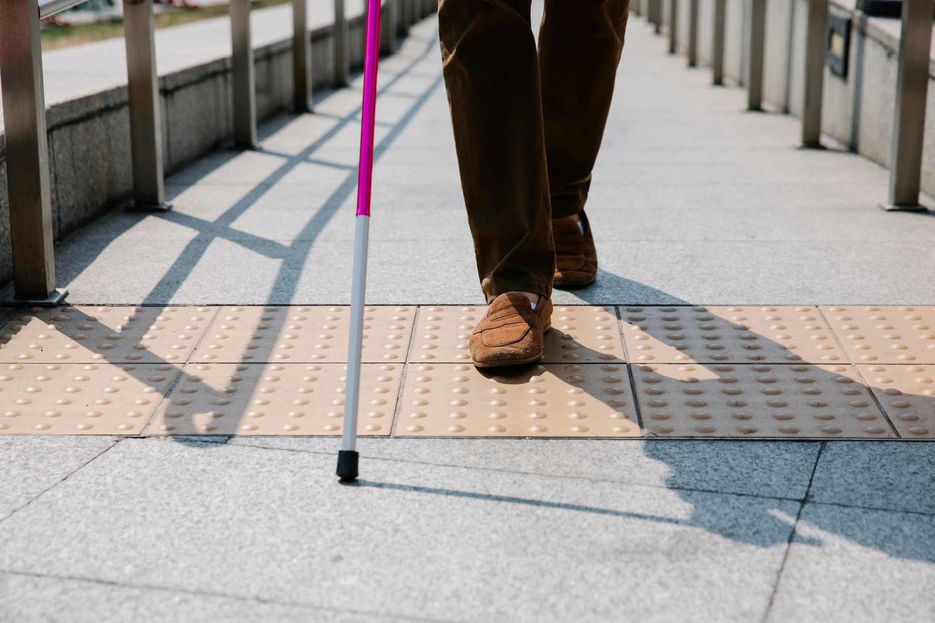
The Science of Contrast and Color
The core of the 2026 trend is the abandonment of “aesthetic” color schemes in favor of “high-contrast” accessibility. Research indicates that as we age, the lens of the eye yellows, making it harder to distinguish between blues and greens, or light grey and white. New regulations are mandating a minimum Light Reflectance Value (LRV) difference between the text and the background.
| Feature | Old Standard (Pre-2020) | 2026 Global Trend |
|---|---|---|
| Font Style | Thin, stylized, or serif | Bold, sans-serif, wide kerning |
| Placement | High (often 2.5m+) | Eye-level (1.2m to 1.5m) |
| Finish | Glossy (causes glare) | Matte (anti-reflective) |
If you are navigating a new city, look for signs that utilize a matte finish. These are specifically designed to be readable under harsh artificial lighting or direct sunlight, preventing the “white-out” effect common on older, glossy plastic signs.
Beyond Text: The Rise of Intuitive Iconography
One of the most significant changes in 2026 is the reduction of text in favor of universal symbols. This is particularly helpful for travelers in foreign countries, but it is also a vital adaptation for those experiencing cognitive fatigue. Text requires the brain to decode language, process meaning, and then execute a movement. Symbols, when designed correctly, bypass the language-processing center of the brain and trigger immediate recognition.
What Effective Iconography Looks Like
In 2026, you will see a move toward “logical pathfinding.” Instead of a single sign, stations are implementing a color-coded floor system. If you are looking for the elevator, you follow the blue line on the floor. If you are looking for the accessible bathroom, you follow the green line. This reduces the need to stop, look up, and search for small signs on walls.
Common Mistake: Relying on mobile apps for navigation in crowded areas. While digital maps are helpful, they can be distracting and dangerous in high-traffic transit hubs. The 2026 trend focuses on “environmental intelligence”—the building itself should tell you where to go, without needing a secondary device.

Digital Kiosks: The New Standard for Interactive Assistance
Physical signs are static, but modern public spaces are increasingly installing digital kiosks. In 2026, these are not just touchscreens; they are “age-responsive.” When a person approaches, the kiosk detects their presence and adjusts its interface. This includes:
- Adaptive Font Size: The text automatically scales up based on the user’s interaction.
- Simplified Menu Structures: Instead of deep, complex sub-menus, the interface offers only the most critical options: “Where is the train?” “Where is the exit?” and “Where is the elevator?”
- Audio Integration: For those with low vision, a physical button (often labeled with Braille) triggers an audio description of the current location and the path to the desired destination.
When using these kiosks, do not feel pressured by the pace of the crowd. These systems are designed to time out slowly, giving you ample time to read the information. If you find a kiosk confusing, look for the “Help” icon, which is now standardized as a large question mark in a high-contrast circle at the bottom-right of the screen.
Mobility and Safety: The “Decision-Point” Strategy
The most dangerous aspect of poor signage is the “last-minute decision.” When a person realizes they are in the wrong lane or heading toward the wrong platform only seconds before the doors close, the risk of a trip or fall increases dramatically. The 2026 urban design standard is the “Decision-Point Strategy.”
This strategy mandates that information must be provided at least 10 meters before a decision needs to be made. If you are walking through a station, you should be able to see the sign for your platform well before you reach the turnstile or the elevator bank. If you find yourself in a space where you are constantly surprised by turns or exits, it is a sign that the facility has not yet adopted modern accessibility standards.
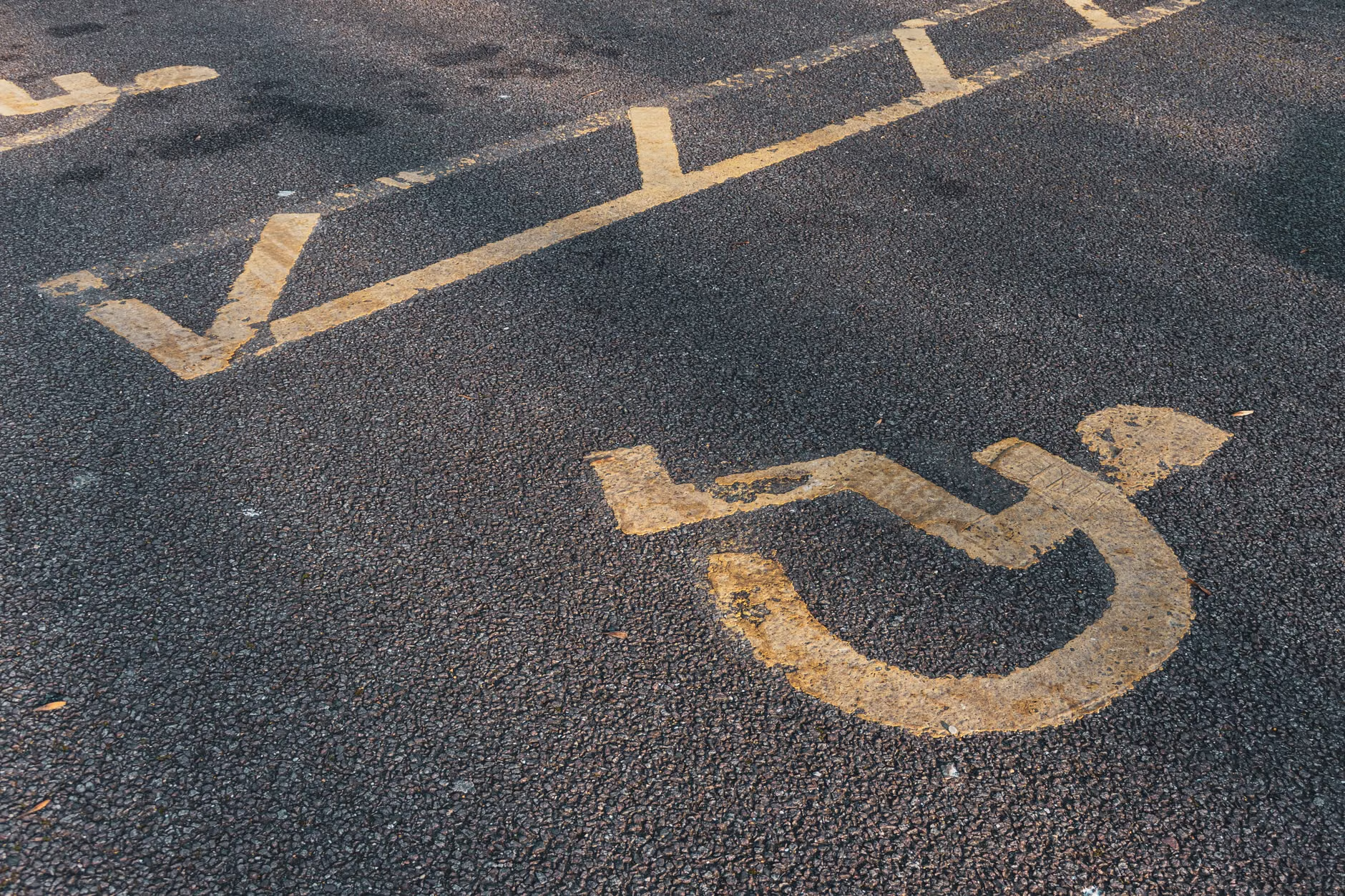
- Identify the Primary Path: Look for the main flow of traffic, but do not feel forced to join the “rush.” Stay to the side, where signage is often more visible.
- Scan for Color Coding: Modern hubs use color to denote functions. Keep an eye on the floor and the wall-level signage for consistent colors that match your destination.
- Prepare Before Leaving: While we advocate for environmental cues, check the official website of the transit authority before you depart. Many now offer “accessibility maps” that highlight step-free routes, which are often different from the “fastest” routes on standard apps.
The Hidden Trade-offs of Modernization
While these advancements are overwhelmingly positive, there is a hidden trade-off: the “digital-first” trap. As cities upgrade, some older, intuitive physical landmarks (like a specific statue or a unique architectural detail) are being replaced by uniform, sterile digital signage. This can make different stations look identical, leading to a phenomenon called “wayfinding fatigue.”
To combat this, remember that your own internal markers are still valid. Do not rely entirely on the new digital systems. If you feel disoriented, look for the “Information Desk,” which is still the most reliable source of help in any major transport hub worldwide. The 2026 trend is to make these desks more visible by placing them in the center of the terminal, rather than tucked away in a corner.
Global Variations in Implementation
It is important to note that these trends are not applied simultaneously across the globe. Countries like Japan, Singapore, and parts of Scandinavia are leading in the implementation of “Universal Design” (the practice of designing products and environments to be usable by all people, to the greatest extent possible, without the need for adaptation or specialized design).
In contrast, many cities in North America and parts of Southern Europe are working with legacy infrastructure. In these regions, you may find that accessibility is retrofitted. This means signs might be placed in awkward locations because they are attached to historical pillars or walls that cannot be moved. In such cases, look for “supplementary signage”—often smaller, temporary-looking signs that have been added to fill the gaps in the original architecture.
Preparing for Your Next Journey
If you are planning a trip, whether local or international, consider these three steps to ensure your mobility and comfort:
- Check for “Step-Free Access” Labels: On transport websites, look for this specific term. It is the gold standard for accessibility, ensuring that you will not encounter stairs or steep ramps.
- Carry a Physical Map: Even in the age of digital, a paper map of the station layout can be a lifesaver. It provides a static reference that does not require a battery or a good signal.
- Know Your Rights: In many jurisdictions, such as the EU (under the Passenger Rights regulations) and the UK (under the Equality Act), you have a legal right to request assistance. Do not hesitate to use these services if you feel the signage is insufficient or the environment is too chaotic.
For more information on accessibility standards in your specific region, you can consult the following global resources:
- ISO 21542:2021 (Building construction — Accessibility and usability of the built environment): This is the international benchmark for architects and urban planners.
- W3C Web Accessibility Initiative (WAI): Provides context on how digital signage is evolving to match physical accessibility needs.
- Local Transit Authority Websites: Always check the “Accessibility” or “Travel Assistance” section on the official website of the city you are visiting before your travel date.
The transition toward 2026 standards is a marathon, not a sprint. While we will continue to see improvements in clarity, contrast, and placement, the individual remains the best judge of their own comfort. By understanding what to look for—and what to watch out for—you can navigate public spaces with greater confidence and independence.
Frequently Asked Questions
1. Why is there so much emphasis on “matte” finishes for signs in 2026?
Matte finishes are essential for reducing glare. As we age, the eye becomes more sensitive to glare from bright lights or sunlight reflecting off glossy surfaces. A matte finish ensures that the text remains readable from various angles and in different lighting conditions, which is crucial for safety and clear navigation.
2. Are digital kiosks replacing human staff in transit hubs?
While many transit authorities are increasing the number of digital kiosks to provide 24/7 information, they are not intended to fully replace human staff. In fact, modern design guidelines recommend that kiosks be placed near information desks so that if a traveler finds the digital interface confusing, they have immediate access to a human assistant.
3. What should I do if I find the signage in a public space confusing or inaccessible?
If you encounter a space that is difficult to navigate, the most practical step is to report it to the facility’s management or the local transit authority. Many cities now have dedicated “Accessibility Feedback” forms on their websites. Providing specific information—such as the location of the sign, why it was hard to read (e.g., too high, poor lighting, low contrast)—helps the authorities prioritize upgrades for future travelers.
Note: This article is intended for informational purposes and does not constitute professional advice on urban planning or medical health. Always assess your own physical condition and comfort level when navigating complex public environments.