Key Takeaways:
- Standardization: By 2026, many urban centers are adopting ISO-aligned signage standards that prioritize high-contrast, large-font, and non-glare materials to assist those with age-related vision changes.
- Proactive Navigation: You can expect to see more “wayfinding” systems that focus on consistent color coding and placement, reducing the cognitive load required to navigate public spaces.
- Advocacy: These changes are not just aesthetic; they are part of a global shift toward “Age-Friendly Cities.” If your local area is lagging, you have the right to request accessibility audits based on these emerging international benchmarks.
The urban landscape is undergoing a silent, essential transformation. As global populations age, city planners and transportation authorities are shifting their focus toward infrastructure that supports independence. Starting in 2026, a new wave of international guidelines for street signage and wayfinding will begin to influence how cities across the globe design their public spaces.
For those aged 60 to 80, this is more than just a change in font size. It represents a fundamental shift in how public services acknowledge the physical and cognitive requirements of an aging population. This article explores what these changes look like, why they matter for your daily mobility, and how you can engage with your local authorities to ensure these standards are implemented effectively in your community.
Understanding the 2026 Global Shift in Signage Standards
The push for age-inclusive signage is largely driven by the World Health Organization’s (WHO) “Age-Friendly World” initiative and evolving International Organization for Standardization (ISO) guidelines. By 2026, the focus moves from “universal design”—which is sometimes too broad—to “inclusive design,” which specifically accounts for the natural changes in vision, gait, and reaction time that occur as we age.
What does this mean in real life? Currently, many street signs are designed for drivers traveling at 50 kilometers per hour. These signs are often too small, lack sufficient contrast, or are placed at heights that are difficult to read for pedestrians with varying degrees of neck mobility or visual acuity. The 2026 standards prioritize the pedestrian experience, specifically those who rely on walking or public transit.
The new standards focus on four primary pillars:
- Luminance Contrast: Ensuring the text and the background have a high enough contrast ratio to be readable even in low-light conditions or for those with cataracts.
- Typography: Moving away from decorative or thin-stroke fonts toward bold, non-serif typefaces that remain legible at greater distances.
- Placement and Glare: Installing signs at lower, more consistent eye levels and using matte finishes to prevent the “veiling glare” that occurs when sunlight hits a glossy sign.
- Predictability: Standardizing the color and shape of signs across different neighborhoods so that you don’t have to relearn the “language” of the city just by crossing a street or taking a bus.

Why Standardized Signage Matters for Your Daily Mobility
For many older adults, the biggest barrier to staying active is not physical frailty, but “navigational anxiety.” When signage is inconsistent, confusing, or poorly placed, it forces a person to stop, search, and recalculate—often in the middle of a busy sidewalk. This increases the risk of falls and general fatigue.
Consider a common scenario: You are trying to find the entrance to a subway station or a bus stop. If the signage is buried among advertisements or placed too high on a pole, you have to crane your neck and squint. This physical strain is unnecessary and often leads to the decision to simply stay home. By standardizing these elements, cities aim to reduce the “cognitive load” of travel. When you know exactly where to look for information, your confidence in navigating the city increases, which directly translates to better physical health through continued activity and social engagement.
The Impact of Contrast and Lighting
As we age, our eyes require more light to perceive contrast. A sign that looks perfectly clear to a 20-year-old may appear as a blurred, gray shape to an 80-year-old. The 2026 guidelines mandate that public authorities test signage for “visual noise.” This means removing competing visual elements—like excessive advertisements near street signs—that make it difficult to focus on critical information. If you find yourself struggling to read signs in your area, this is not a personal failure; it is a failure of the current urban design to meet international accessibility norms.
While these standards are being adopted globally, implementation varies by jurisdiction. In some countries, such as those in the European Union, the transition is being driven by strict legislative mandates. In others, it is happening through voluntary municipal adoption. Here is how you can assess and advocate for your needs.
| Feature | Old Standard (Common) | 2026 Inclusive Standard | Benefit to You |
|---|---|---|---|
| Font Style | Variable (often thin) | Bold, Sans-Serif | Easier to read at a distance |
| Sign Placement | High on poles | Eye-level / Lowered | Reduces neck strain |
| Material | Glossy/Reflective | Matte/Anti-glare | Reduces eye fatigue |
| Color Scheme | Low contrast | High contrast (e.g., Black/White) | Improved recognition for vision loss |
The table above highlights the shift. If you live in an area where the “Old Standard” still prevails, you are dealing with an environment that was not designed for your current needs. Do not be afraid to contact your local council or transport authority. Many cities have a “Citizens’ Portal” or “Accessibility Feedback” email address. When you provide feedback, be specific: “The sign at [Location] is too high and reflects too much sunlight to be read comfortably.” This is actionable data for city planners.
Safety and Accessibility: Beyond Just Signs
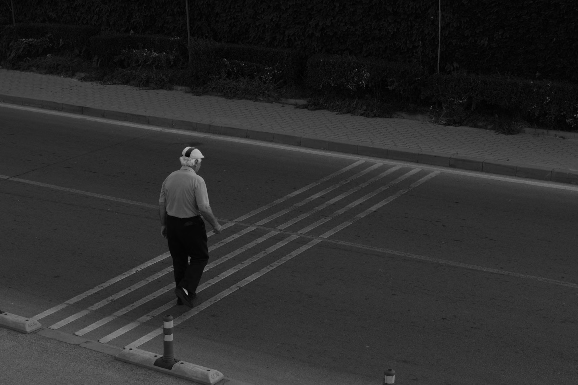
Street signage is only one part of the puzzle. The 2026 standards also integrate with pedestrian crossing systems. You may notice more “countdown timers” at crosswalks. These are vital for older pedestrians, as they provide a clear, numerical indication of how much time remains to cross the street. This eliminates the uncertainty of whether you have enough time to safely reach the other side, allowing you to pace yourself rather than rushing and risking a trip or fall.
Another development is the use of tactile paving and high-visibility road markings. These are being designed to work in tandem with new signage. For example, a sign indicating a bus stop will now be paired with a consistent color-coded strip on the pavement leading to the boarding area. This “wayfinding chain” ensures that you are guided from the sidewalk to the transport vehicle without having to guess the route.
Managing Stamina and Rest Opportunities
A critical, often overlooked variable in urban design is the availability of rest. The 2026 standards encourage “micro-resting” points. If a sign indicates a destination is 500 meters away, there should ideally be a seating area or a grab-rail at the 250-meter mark. If your city is undergoing renovations, look for these features. If they are absent, advocate for “rest-stop integration” in your local planning meetings. It is a reasonable request for an age-friendly city.

Advocacy: Making Your Voice Heard
You do not need to be an urban planner to influence your city’s accessibility. Most municipalities have public consultation periods before major infrastructure projects. Here is how to participate effectively:
- Identify the Authority: Determine if your street signage is managed by the city council, the regional transportation authority, or the national highway department.
- Use the “Audit” Approach: Instead of complaining, offer an “accessibility audit.” Take photos of signs that are difficult to read and send them to the relevant department with a polite note requesting an update based on the 2026 inclusive design standards.
- Join a Local Forum: Many cities have “Senior Advisory Boards” or “Accessibility Committees.” These groups are often the primary channel through which the city receives feedback on infrastructure.
- Focus on Safety: Use language that highlights safety. “The lack of high-contrast signage makes it difficult for pedestrians to navigate safely, increasing the risk of accidents,” is a much more effective argument than “The sign is hard to read.”
Remember, these standards are being introduced because the global demographic is shifting. You are not asking for a favor; you are asking for the infrastructure to be brought up to date with the modern, aging population that contributes to the vibrancy of your community.
Conclusion: The Path Forward
The 2026 global standards for age-inclusive street signage represent a significant step toward a more accessible world. By prioritizing clarity, contrast, and consistency, these changes aim to ensure that your ability to move through your city is not limited by environmental design. The goal of these standards is to foster autonomy, allowing you to walk, travel, and engage with your community with confidence.
Stay informed about the projects happening in your area. Use the resources provided by your local government to track these improvements. When you see a new, high-contrast sign or a better-marked crossing, recognize it as the result of a movement toward a more inclusive society. By staying proactive and vocal about your needs, you help ensure that these standards become the norm rather than the exception.
For further information on global age-friendly initiatives, you can visit the World Health Organization’s Age-Friendly World portal, which provides resources on how cities are adapting to the needs of older residents.
Frequently Asked Questions
1. Do these 2026 standards apply to all countries?
The standards, such as those set by the ISO, are international benchmarks. While they are not “global laws,” they are increasingly being adopted by national governments and local municipalities as the required standard for new infrastructure projects. Check with your local city council or department of transportation to see if they have formally adopted these specific accessibility guidelines.
2. What should I do if I find a street sign in my area that is dangerous or unreadable?
Document the location with a photo and a brief description of why it is difficult to use (e.g., “The sign is obscured by tree branches,” or “The contrast is too low to read at dusk”). Submit this through your city’s official maintenance or public works portal. If you do not receive a response, reach out to your local representative or an advocacy group for seniors in your community.
3. Are these changes only for people with vision loss?
No. While they are essential for those with vision changes, these standards benefit everyone. High-contrast, clear signage reduces cognitive load for all pedestrians, improves safety for drivers, and makes cities more welcoming for visitors who are unfamiliar with the area. Inclusive design is designed to be better for everyone, regardless of age or ability.
Disclaimer: This article is for informational purposes and provides guidance on navigating public infrastructure. It does not constitute legal or professional advice. Always check with your local jurisdiction for specific rules and regulations regarding public signage and accessibility.