Key Takeaways:
- Standardized Clarity: The 2026 updates prioritize high-contrast, non-glare, and icon-heavy signage to reduce cognitive load and visual fatigue for older passengers.
- Predictable Navigation: New standards mandate consistent placement of information, ensuring that transit hubs follow a uniform layout regardless of the city or country.
- Empowered Travel: By understanding these changes, you can plan your journeys with greater confidence, knowing that global transit systems are increasingly designed to support independent mobility.
Public transit systems worldwide are undergoing a significant transformation. By 2026, many major transit networks will implement new, age-inclusive signage standards designed to make travel easier, safer, and more intuitive for older adults. These changes are not merely aesthetic; they are grounded in physiological research regarding vision, reaction time, and information processing as we age.
Why 2026 Signage Standards Matter for Your Daily Mobility
Navigating a bustling train station or a complex bus terminal can be challenging, especially when signage is cluttered, poorly lit, or inconsistent. The upcoming 2026 standards, influenced by international bodies like the ISO (International Organization for Standardization) and local accessibility mandates, focus on removing these barriers.
As we age, our eyes often require more contrast to discern details, and our ability to filter out “visual noise”—the clutter of advertisements and non-essential information—decreases. The 2026 updates address this by mandating:
- High-Contrast Ratios: Signage must meet specific luminance contrast levels (usually a minimum of 70%) to ensure text stands out clearly against its background.
- Non-Glare Materials: To prevent reflections from overhead lighting, all new signage must utilize matte or anti-glare coatings.
- Reduced Cognitive Load: Signage will rely more on universally recognized icons rather than dense text, allowing for faster processing of information.

Understanding the Shift: What Changes in 2026?
The transition to these new standards is not happening overnight, but by 2026, you will notice a marked difference in how public spaces communicate. The following table outlines the key areas of improvement and what they mean for your travel experience.
| Feature | Old Standard (Common Issues) | 2026 Update |
|---|---|---|
| Typography | Small, serif fonts; thin strokes. | Large, sans-serif, bold, and high-contrast fonts. |
| Lighting | Direct, reflective, or dim lighting. | Integrated, soft, glare-free LED illumination. |
| Icons | Ambiguous or varied symbols. | Standardized, internationally recognized icons. |
| Placement | High up, often blocked or hidden. | Eye-level, consistent, and predictable locations. |
This shift is designed to ensure that even in a foreign city, you can navigate a terminal by recognizing standard symbols rather than struggling with local languages or complex maps. The focus is on predictability—the idea that you should know exactly where to look for your platform or bus stop number as soon as you enter a facility.
Even with improved signage, adapting to a new transit environment requires a bit of preparation. If you are planning a trip, consider these steps to maximize your comfort and safety.
1. Pre-Trip Digital Reconnaissance
Most modern transit authorities provide “station maps” on their websites. Before you leave, check if your departure and arrival stations have updated their signage maps. Look for symbols indicating lifts (elevators), accessible toilets, and level boarding areas. If a station is undergoing construction for 2026 compliance, the website will often list temporary detours.
2. The “Eye-Level Rule”
One of the most significant changes in the 2026 standards is the mandate for eye-level signage. If you feel overwhelmed, stop walking and scan the walls at roughly 1.5 meters (about 5 feet) high. This is where the most critical information—directional arrows and line maps—will now be placed, rather than high above your head where it can be obscured by overhead structures.
3. Managing Cognitive Fatigue
Public transit can be mentally draining. If you find yourself struggling to read a sign, it is often due to “information overload.” When you feel this happening, look for the color-coded lines. Most major cities are moving toward a color-coded system that remains consistent throughout the journey. Focus only on your color, and ignore the other routes until you reach your transfer point.
Comparing Accessibility Features Across Regions
While the 2026 standards represent a global push, the implementation varies by jurisdiction. Understanding these differences can help you manage your expectations when traveling internationally.
- European Union (EU): The EU is currently enforcing the “European Accessibility Act,” which requires transit operators to ensure that information is accessible in multiple formats—visual, audio, and tactile. You will likely find more auditory announcements accompanying the new signs in EU transit hubs.
- North America (USA/Canada): Focus is heavy on the “ADA” (Americans with Disabilities Act) compliance, which emphasizes tactile signage (Braille and raised letters). By 2026, many stations will integrate these tactile elements directly into the new high-contrast signage boards.
- Asia-Pacific (e.g., Japan/Singapore): These regions are leading in “digital wayfinding.” Expect to see large, interactive touchscreen kiosks that allow you to zoom in on maps and request routes in your preferred language.
A Note on Limitations: While these standards are a massive step forward, they are not a substitute for your own mobility assessment. If you have significant balance issues or rely on mobility aids, always check if the “accessible” route involves a long walk to a distant elevator. Sometimes, the most “accessible” path on a map is not the most efficient one for your specific stamina level.
Hidden Challenges: What the Standards Might Overlook
While we celebrate the move toward better signage, there are subtle variables that even the best standards might not fully address. Being aware of these will help you stay ahead.
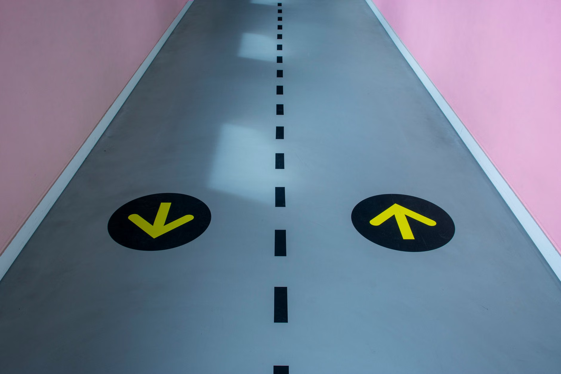
The “Speed of Flow” Factor: Newer, clearer signage often encourages faster passenger movement. In crowded stations, this can create a “rushing” effect. If you prefer a slower pace, avoid the center of the flow; stick to the edges of the walkway. The 2026 standards require signage to be visible from the periphery, so you do not need to be in the middle of the crowd to see your path.
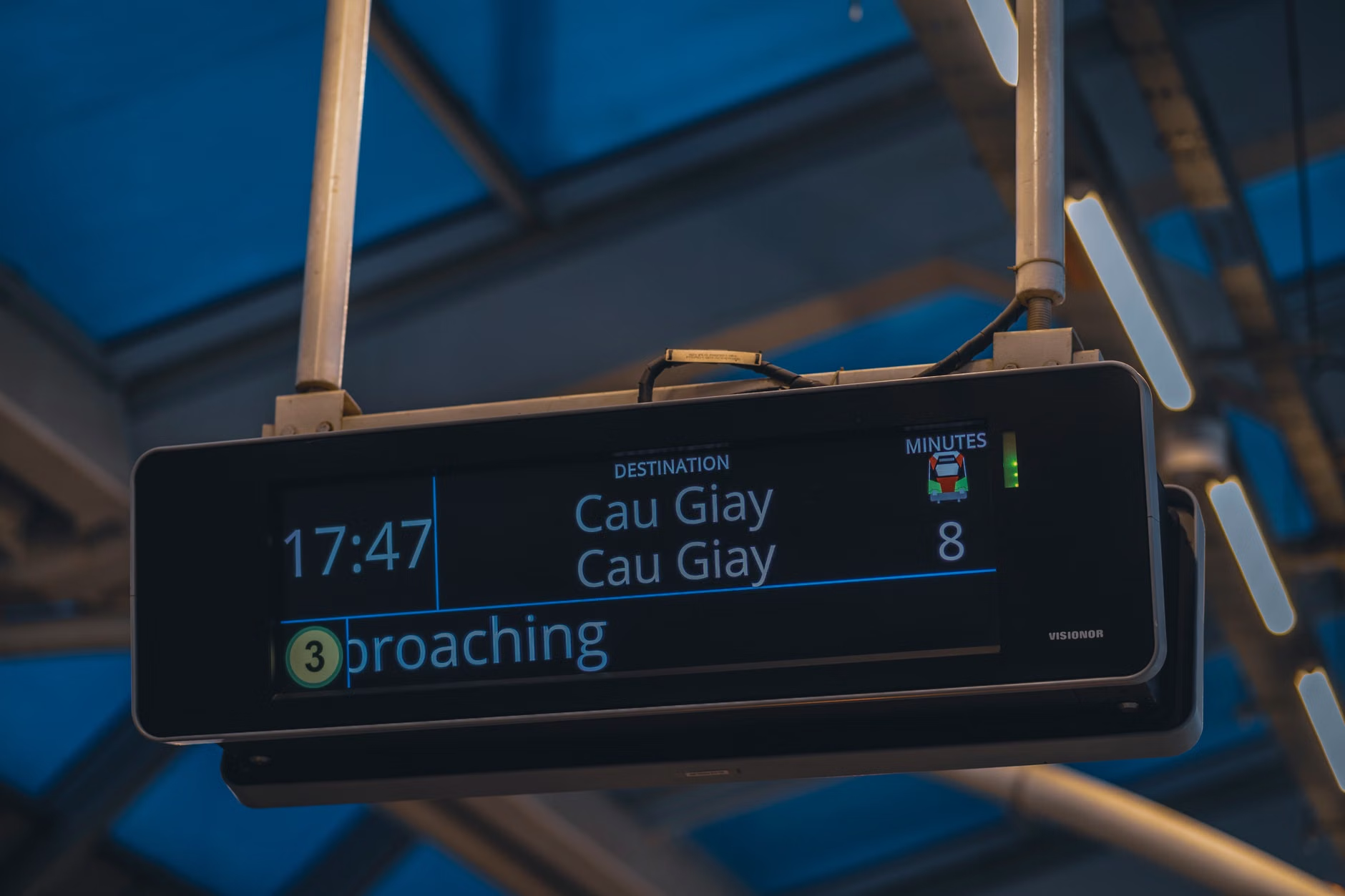
Digital Glare: Even with “non-glare” mandates, digital screens in very bright, sun-lit station entrances can still be difficult to read. If you cannot see a digital screen, look for the static, printed alternatives. The new standards require that critical information (like exits and emergency routes) be available on non-digital, permanent signs that are immune to power outages or screen glare.
Planning Your Next Journey: A Practical Checklist
Before you set out on your next journey, ensure you have the tools to navigate with confidence. Use this checklist as your guide:
- Check the Transit App: Most major cities have an official app. Download it before you leave home and ensure it has “accessibility mode” enabled.
- Identify “Safe Zones”: When entering a station, identify the location of the help desk or the customer service station. If you get lost, this is your primary point of contact.
- Pack for Stamina: Even if a station is perfectly signed, it may be large. Assume an extra 15 minutes of travel time to account for walking through massive transit hubs.
- Verify Your Route: Always have a backup plan. If a lift is out of service, does the signage indicate an alternative route? If not, ask a staff member immediately.
Conclusion: Taking Control of Your Journey
The 2026 signage updates are a victory for independent travel. By moving toward standardized, high-contrast, and intuitive communication, transit systems are acknowledging that mobility is a lifelong right. Your ability to navigate the world remains a key component of your independence. By familiarizing yourself with these changes, you are not just keeping up with technology; you are ensuring that your travel remains a source of joy and exploration rather than a source of stress.
Frequently Asked Questions (FAQ)
1. Will these signage changes apply to all transit systems globally?
No, these are international guidelines and national mandates. While major metropolitan hubs are adopting them rapidly to meet 2026 compliance, smaller, rural, or privately operated transit systems may take longer to upgrade. Always check the official website of the transit authority in your destination city for the most accurate information.
2. What should I do if I find a station that is not yet updated?
If you encounter a station with poor signage, rely on official mobile applications or printed maps available at information kiosks. Do not hesitate to approach station staff. They are trained to assist passengers and can provide the most current information regarding accessible routes that might not be clearly marked on older signage.
3. Are these changes only for people with visual impairments?
While the standards were developed with visual impairment in mind, they benefit everyone. High-contrast, clear, and icon-based signage reduces mental fatigue for all passengers, regardless of age or ability. By simplifying the way information is presented, these systems make transit more efficient for everyone, including those who are unfamiliar with the local language.
For further information on global accessibility standards, you can refer to the ISO 21542:2021 guidelines for building construction and accessibility, which underpin many of these transit signage improvements.