- The 2026 ISO standards prioritize high-contrast, non-glare materials and consistent iconography to reduce cognitive load for older commuters.
- New signage mandates focus on “wayfinding continuity,” ensuring information is provided at every decision point, not just at the destination.
- Older travelers should look for “International Accessibility Symbols” and standardized color-coding systems that are being adopted globally to replace language-dependent text.
For many older adults, the independence of traveling via public transit relies heavily on the ability to navigate complex stations, understand schedule changes, and identify routes quickly. By 2026, a significant shift in global infrastructure is underway as international bodies, including the International Organization for Standardization (ISO), begin implementing updated guidelines for age-inclusive signage. These changes are designed to minimize the stress of travel by focusing on legibility, simplicity, and physical accessibility.
The Evolution of Transit Signage: Why 2026 Matters
Historically, transit signage was designed for the “average” commuter—often defined as a younger adult with high visual acuity and fast reaction times. As global populations age, transit authorities have recognized that signage must accommodate a wider spectrum of vision, mobility, and cognitive processing speeds. The 2026 standards represent a transition from “accessible” (meeting basic requirements) to “inclusive” (designing for the full range of human capability).
What does this mean for the daily commuter or the occasional traveler? It means that transit hubs are moving away from cluttered, text-heavy displays toward systems that rely on intuitive visual cues. Research suggests that as we age, our ability to distinguish between similar colors decreases, and our sensitivity to glare increases. The new standards address these challenges by mandating specific contrast ratios and lighting conditions that remain effective even in dim or overly bright environments.

The Core Principles of the New Standards
The 2026 updates are built on four foundational pillars designed to assist travelers aged 60 to 80:
- Contrast and Luminance: Signage must maintain a minimum contrast ratio of 70% between text and background. This ensures that signs are readable even for those with mild cataracts or reduced color perception.
- Cognitive Ergonomics: Information is presented in a “chunking” format. Instead of long lists of stops, displays will prioritize the “next three arrivals” or “major transfer points,” reducing the amount of information the brain needs to process at once.
- Physical Placement: Signs are being moved to “eye-level” zones (typically 1.4 to 1.7 meters from the floor) rather than hanging high above, where they can be obscured by lighting or ceiling architecture.
- Consistency of Iconography: Symbols will be standardized globally. A “lift” or “elevator” icon will look the same in a station in Tokyo as it does in London or New York, reducing the need to read local languages.
Wayfinding is the process of identifying your location and finding your way to a destination. For an older traveler, this often involves multiple decision points: entering the station, finding the correct platform, and locating the elevator or ramp. The 2026 standards introduce “continuity of information,” which means that once you see a sign for your line, that same symbol or color-coded path should be visible until you reach your train.
When navigating a large, unfamiliar station, follow this practical checklist to maintain your pace and reduce anxiety:
- Identify the Color-Code: Before looking for text, scan for the color assigned to your line. Modern signage uses consistent color-coding that is easier to spot from a distance than small, printed text.
- Locate the “Decision Point” Signs: New standards require signage at every intersection or turn. If you do not see a sign at a fork in the path, stop and look for the nearest wall-mounted directory.
- Verify with Digital Displays: Look for the “Next Train” digital screens. The 2026 standards require these to be placed at a distance that allows for reading without needing to stand directly underneath them.
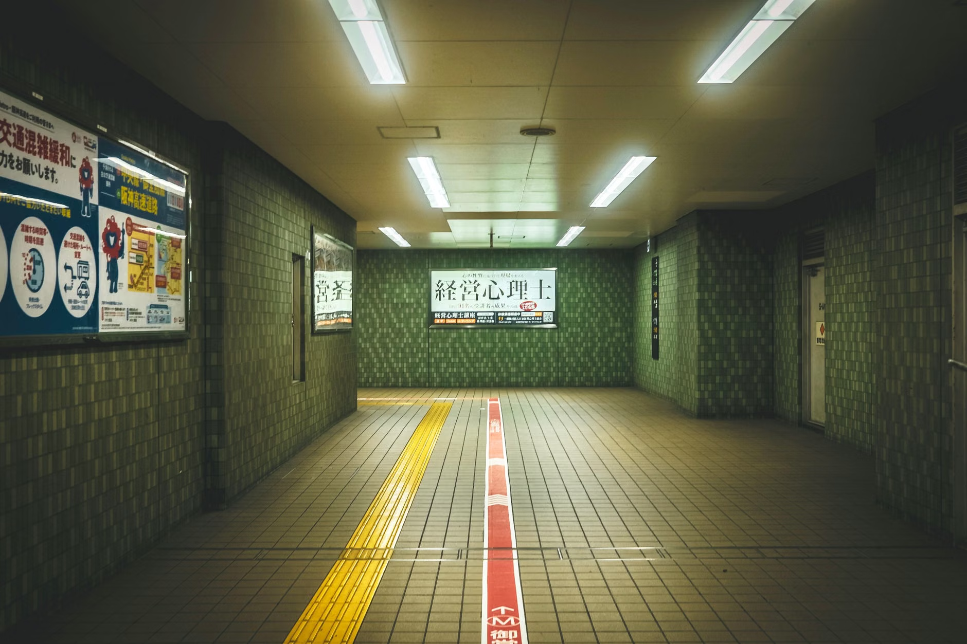
- Utilize Tactile Cues: If you have limited vision, look for tactile paths on the floor—these are textured strips that lead directly to key amenities like ticket machines, elevators, and platform edges.
Comparing Old vs. New Signage Standards
Understanding the difference between legacy signage and the new 2026-compliant systems can help you manage your expectations when traveling. The following table illustrates the shift in design philosophy.
| Feature | Legacy Signage | 2026 Inclusive Standard |
|---|---|---|
| Text Size | Small, often condensed | Large, sans-serif, high-legibility font |
| Color Use | Low contrast (e.g., light grey on white) | High contrast (e.g., black on yellow/white) |
| Placement | High ceilings or irregular spots | Consistent eye-level zones |
| Information Density | Complex, cluttered maps | Simplified, “need-to-know” focused |
What this means for you: In stations that have not yet been updated to the 2026 standard, you may encounter “information overload.” In these cases, it is safer to rely on the “Follow the Line” technique: identify the color of your destination line on a map and follow that color on the floor or walls, ignoring other text until you reach the platform.
Managing Mobility and Stamina in Transit Hubs
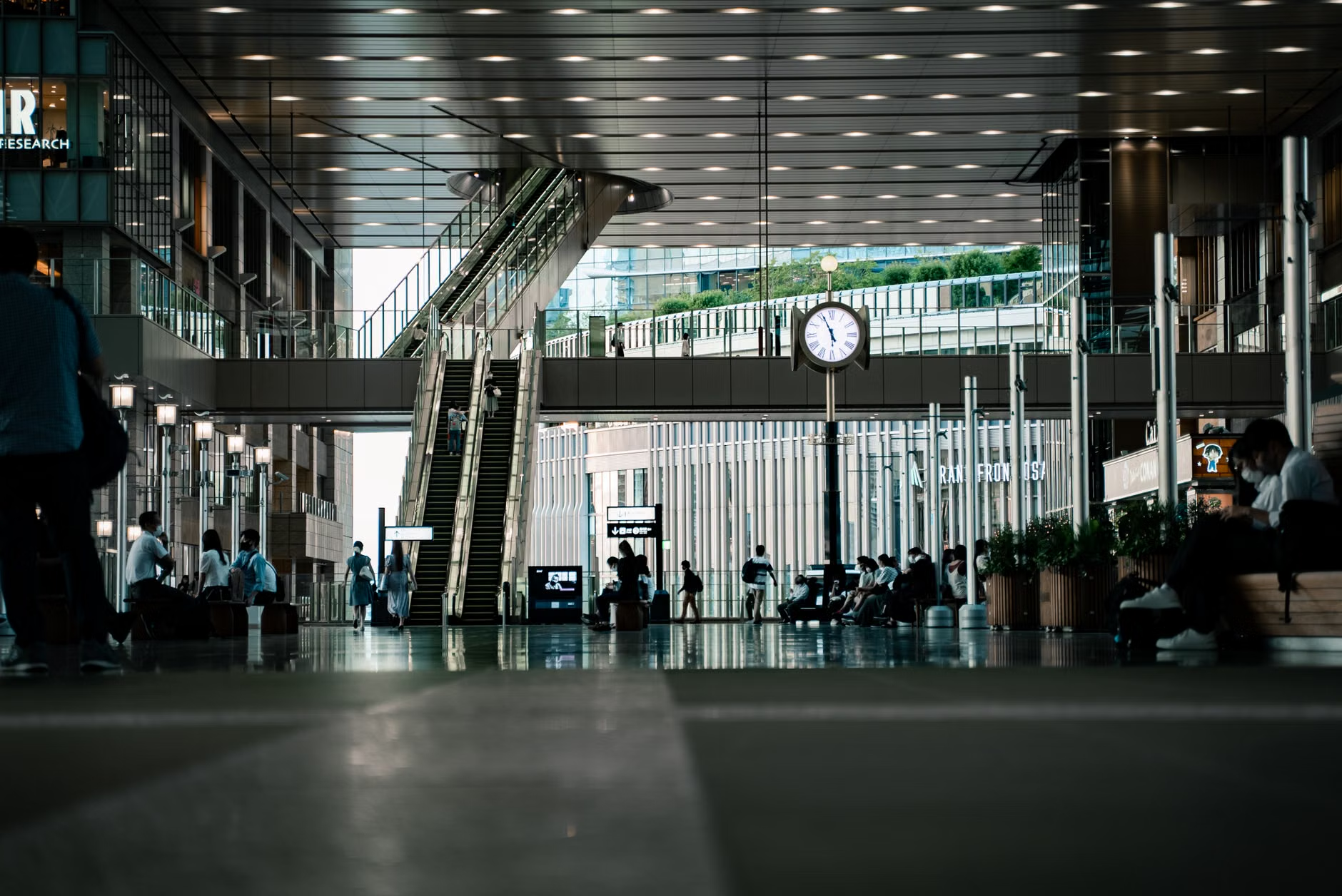
Signage is only one part of the transit experience. Your physical stamina and mobility are equally important when navigating large transport hubs. The 2026 standards also include guidelines for “rest-stop intervals,” suggesting that signage should indicate the distance to the nearest seating area or elevator.
If you are planning a trip, consider these factors to ensure your journey remains comfortable:
- The “Distance-to-Amenity” Rule: When arriving at a new station, look for signs indicating the distance to the platform. If the station is massive, do not hesitate to use the designated seating areas marked on the signage to rest before completing your journey.
- Elevator vs. Escalator: While escalators are faster, elevators are often more accessible for those with luggage or reduced balance. Look for the “Universal Accessibility” symbol (the blue sign with the wheelchair icon). Even if you do not use a mobility aid, these elevators are generally safer and less crowded.
- Off-Peak Travel: Whenever possible, travel during off-peak hours (typically 10:00 AM to 3:00 PM). This not only makes the station less crowded, allowing you to see the signage clearly, but it also means you are less likely to be rushed by other commuters.
Common Misconceptions About Age-Inclusive Design
One common mistake is the belief that “accessible” signage is only for those with severe disabilities. In reality, inclusive design benefits everyone. Clear, high-contrast signs help a tourist who does not speak the local language just as much as they help an older adult with vision changes. Another misconception is that digital screens are always better than static signs. While digital screens provide real-time updates, they can be difficult to read if the refresh rate is too fast or if the screen is prone to glare. The best transit hubs use a combination of both.
Hidden Inconvenience: Be aware of “transition zones.” These are areas between the street and the station entrance where lighting conditions change rapidly from natural sunlight to artificial indoor light. Your eyes may take several seconds to adjust. During this time, your ability to read signage is temporarily reduced. Always pause for a few seconds when entering a station to allow your eyes to adapt before attempting to read directions.
Practical Preparation for Your Journey
To make the most of the 2026 standards, preparation is key. Before leaving home, use the transit authority’s official app or website to check if your route has been updated with the latest accessibility features. Many major cities now provide “Station Maps” that highlight the location of elevators, toilets, and seating areas.
Keep a “Travel Kit” for Navigation:
- Magnifying Lens: A small, pocket-sized magnifying glass can be a lifesaver for reading fine print on paper maps or small station information boards.
- Digital Backup: If you are comfortable using a smartphone, ensure your transit app is updated. Many apps now offer “Voice-Over” features that can read signage or directions aloud to you.
- Symptom/Need Record: If you have specific needs (e.g., needing to avoid stairs), keep a small note in your pocket. If you need to ask for help, you can simply show this note to station staff to get a clear, concise answer.
Addressing Safety Concerns
Safety is the primary driver behind the 2026 standards. Falls in transit stations are often caused by rushing to read a sign or failing to see a change in floor elevation. The new standards mandate that floor-level changes (like steps or ramps) must be marked with high-contrast strips. If you encounter an area that feels unsafe or poorly marked, report it to station staff. Transit authorities rely on passenger feedback to identify “danger zones” that may not be apparent in their design plans.
Remember, the goal of these standards is to make public transit an asset for your lifestyle, not a source of stress. By understanding how to read and use these new systems, you can maintain your mobility and confidence, whether you are running errands in your home city or exploring a new destination abroad.
Conclusion
The implementation of the 2026 global standards for transit signage marks a significant step forward in recognizing the needs of an aging global population. By prioritizing contrast, consistency, and cognitive simplicity, these standards aim to empower older adults to travel with greater ease and independence. As these changes roll out, focus on utilizing the standardized icons, following color-coded paths, and taking the time to adjust to new environments. Transit is meant to be a public service for all, and these improvements ensure that it remains a viable, safe, and efficient option for you.
Frequently Asked Questions
1. Will these 2026 standards apply to all public transit stations worldwide?
The standards are developed by the International Organization for Standardization (ISO). While they are voluntary, most major transit authorities adopt them as they upgrade their infrastructure. You will likely see these changes first in large international hubs and major city networks.
2. What should I do if I am in a station that is not yet updated?
If you are in an older station, rely on the “Follow the Line” method. Identify the color of your destination line on the map and look for that color on the walls or floor. If you feel lost, look for a station map—these are usually located near entrances and are often more readable than individual signs.
3. Are these signage changes helpful for people with hearing impairments too?
Yes. The 2026 standards emphasize visual communication, which is highly beneficial for those with hearing impairments. By reducing reliance on audio announcements and increasing the clarity of visual displays, the system becomes more inclusive for a broader range of passengers.
For further information on global accessibility standards, you can visit the ISO Official Website to view their guidelines on inclusive design and public infrastructure.