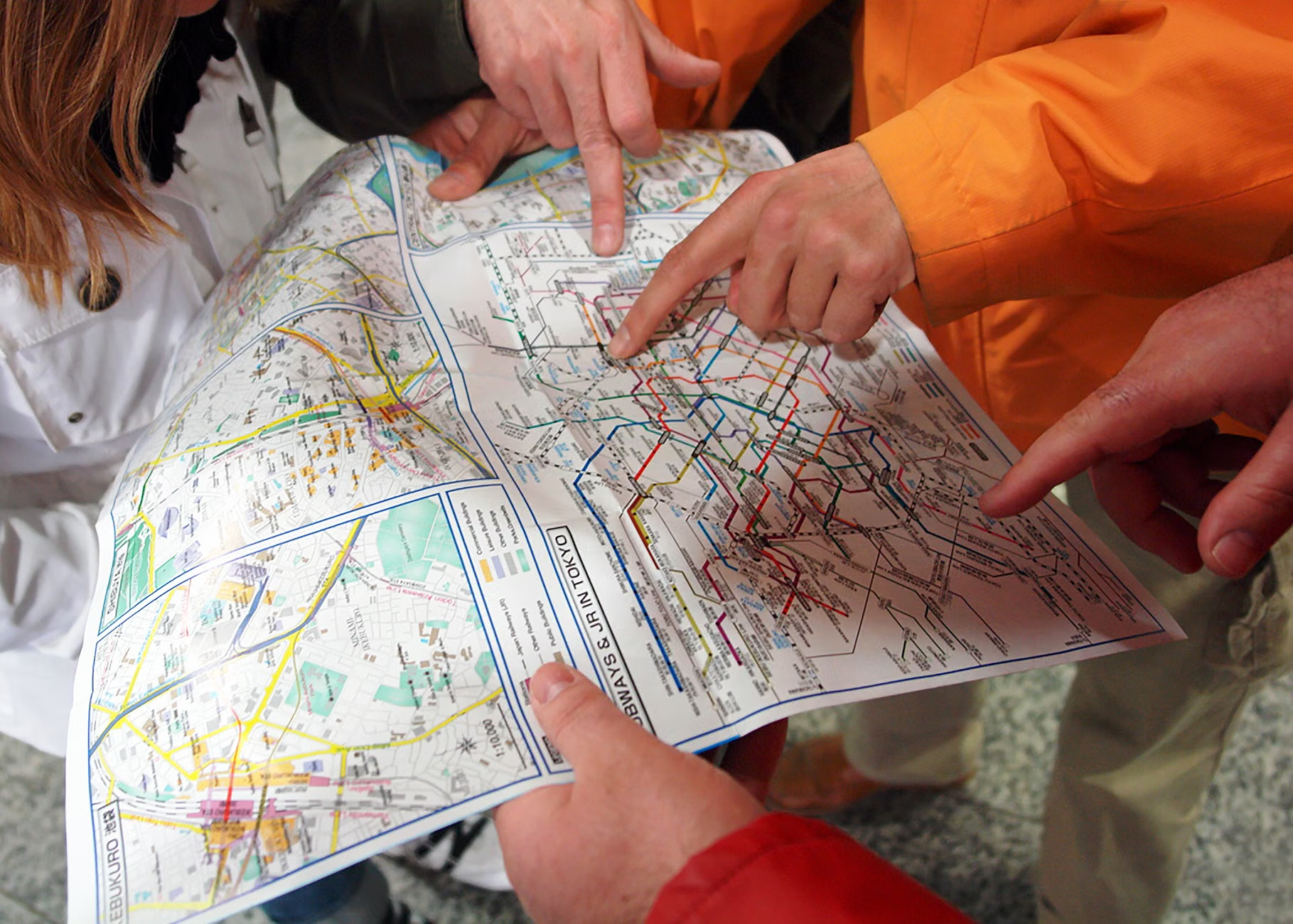
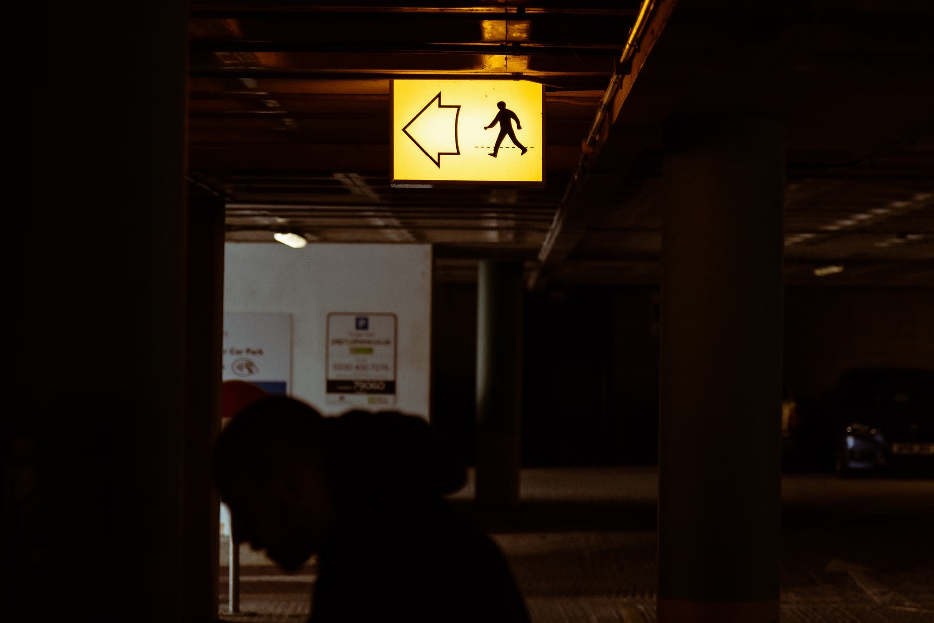
- The 2026 global standards focus on high-contrast visuals, larger typography, and standardized, intuitive pictograms to reduce cognitive load and improve reaction times for older pedestrians.
- New mandates emphasize “predictable” street design, meaning signs will be placed at consistent heights and locations to ensure they are easily spotted without neck strain or excessive scanning.
- As these changes roll out, you can advocate for local implementation by checking your municipality’s public works website for “Universal Design” or “Age-Friendly City” initiatives.
By 2026, urban environments across many developed nations will begin a transition toward standardized, age-inclusive signage. This shift is not merely an aesthetic update; it is a fundamental redesign of public space intended to accommodate the visual, cognitive, and mobility needs of an aging global population. Understanding these changes will help you navigate your community with more confidence and safety.
The core objective of the 2026 standards is to eliminate the confusion caused by cluttered, inconsistent, or poorly lit signage. Whether you are walking to a local market or navigating a complex transit hub, the goal is to ensure that information is accessible at a glance, regardless of changes in your vision or processing speed.
The Rationale Behind the 2026 Standards
Urban planning has historically focused on the needs of the “average” adult, often ignoring the physiological changes that occur as we age. Between the ages of 60 and 80, many individuals experience a natural reduction in contrast sensitivity, a narrowing of the peripheral visual field, and a slight increase in the time required to process complex visual information.
If a street sign is small, uses low-contrast colors (such as grey text on a white background), or is placed behind obstacles, it creates a “cognitive bottleneck.” You are forced to stop, stare, and manually process the information, which can be stressful in heavy traffic or crowded environments. The 2026 standards address this by mandating:
- High-Contrast Ratios: Requiring specific luminance contrast levels between text and background to ensure readability in varying weather conditions.
- Standardized Font Sizing: Minimum character heights that account for typical viewing distances at specific walking speeds.
- Universal Pictograms: Reducing reliance on text, which requires more cognitive processing power, in favor of globally recognized symbols that convey meaning instantly.
This shift is part of a broader movement toward “Universal Design,” an approach to building products and environments that are inherently accessible to all people, without the need for adaptation or specialized design.
What Changes Will You See in Your Daily Life?
You may not notice the changes overnight, as they will be implemented during regular infrastructure maintenance cycles. However, as municipalities upgrade their streetscapes, you will likely encounter three major improvements.
1. Consistent Placement and Height
One of the most common frustrations for older pedestrians is “visual clutter.” Signs are often placed at varying heights, forcing you to look up, down, or around obstacles. The new standards require signs to be placed at a “predictable eye level.” This minimizes neck strain and ensures that you can scan the environment horizontally, keeping your focus on the path ahead rather than searching for information.
2. Enhanced Lighting and Reflectivity
As we age, our eyes require more light to perceive the same level of detail that a younger person might see in dim conditions. The 2026 standards mandate high-reflectivity materials for all pedestrian signs and improved ambient lighting for signage at night. This is particularly important for your safety when crossing streets after dusk, as it allows drivers to see your intentions more clearly and helps you identify your destination without squinting.
3. Simplified Information Delivery
Have you ever encountered a sign with too much information—multiple arrows, small text, and conflicting symbols? The new standards aim to “de-clutter” the street. Instead of one sign containing five pieces of information, the standard recommends breaking that information into a sequence of signs. This ensures that you are only processing one or two critical pieces of information at any given time, which significantly reduces mental fatigue.
Comparing Old vs. New Standards
The table below summarizes the shift from traditional signage to the upcoming 2026 age-inclusive standards.
| Feature | Traditional Signage | 2026 Age-Inclusive Standard |
|---|---|---|
| Font Size | Variable; often small | Minimum 10cm-15cm character height |
| Contrast | Moderate; prone to fading | High-luminance, durable materials |
| Placement | Variable height; often obstructed | Consistent, predictable eye-level |
| Visual Load | High; text-heavy | Low; pictogram-focused |
What this means for you: If you find yourself frequently misreading signs or feeling overwhelmed by navigation in city centers, these changes will likely make your daily outings much smoother. The high-contrast designs are particularly helpful if you have early-stage cataracts or other common age-related vision changes, as they emphasize shape and color over fine-line detail.
Practical Steps to Advocate for Your Community
While these standards provide a global framework, implementation is often left to local city councils or transportation departments. If your neighborhood still relies on outdated, difficult-to-read signage, you can play a role in accelerating the adoption of these new standards.
Step 1: Identify the Issue. Take note of specific intersections or pedestrian paths where signage is confusing, poorly lit, or obstructed. Rather than just being frustrated, document it. A simple photo and a brief note about why it is difficult to navigate (e.g., “sign is too low,” “text is too small to read at a distance”) is powerful evidence.
Step 2: Contact Your Local Transportation Department. Most cities have a “Public Works” or “Transportation” department. Their websites usually have a feedback form or a “Report a Problem” section. Use these tools to request an assessment based on “Universal Design” principles.
Step 3: Connect with Local Advocacy Groups. Many cities have “Age-Friendly City” committees or senior advocacy groups. These organizations often have direct channels to city council members and can amplify your request to ensure that infrastructure upgrades prioritize the needs of older residents.
Hidden Inconvenience: Be aware that during the transition period, you may encounter “mixed” signage. Some streets may have the new, clearer signs, while adjacent streets may still have the old ones. This inconsistency can be jarring. If you are going to a new part of town, do not hesitate to use digital mapping tools on your smartphone to supplement physical signage—they are often updated faster than physical infrastructure.
Safety and Mobility: Staying Confident on the Move
The 2026 standards are designed to support your independence, but they are not a substitute for personal safety habits. As these signs are rolled out, keep these three safety strategies in mind:
- Anticipate the Path: Even with better signage, always scan the road ahead for potential hazards like uneven pavement or unexpected construction, which may not always be marked with advanced notice.
- Maintain Your Pace: Do not feel pressured by the speed of others. The new signage is intended to help you process information quickly, but you should always walk at a pace that feels stable and comfortable for you.
- Utilize Auditory Signals: Many cities are pairing the new visual signs with “auditory pedestrian signals” (the chirping or clicking sounds at crosswalks). If you find visual navigation challenging, check if your local area has installed these, as they provide a crucial secondary layer of information.
If you notice that your ability to read signs or navigate is rapidly declining, it is important to speak with your primary care provider or an optometrist. Sometimes, subtle changes in vision can be easily addressed with updated prescriptions, which will make the benefits of these new, clearer signs even more effective.
The Role of Technology in Integration
While the 2026 standards focus on physical infrastructure, they are increasingly being integrated with digital “smart city” technologies. Many modern transit apps are now pulling data from these standardized signs to provide real-time, high-contrast digital overlays on your smartphone screen.
If you enjoy using technology, consider downloading your local transit authority’s official app. Many of these apps now feature “Accessibility Modes” that prioritize high-contrast maps and provide voice-guided navigation, which complements the physical signage on the street. This dual approach—using both the physical signs and digital tools—is the most effective way to ensure you never feel lost or uncertain when traveling.
Addressing Common Misconceptions
It is important to clarify a few misconceptions about these upcoming standards. First, some believe that these signs will be “too large” and ruin the aesthetic of historic districts. In reality, the 2026 standards prioritize “elegant design,” meaning the signs are high-contrast and clear but designed to blend into the architectural context of the area. They are not giant, neon-colored billboards.
Second, there is a fear that these changes will be extremely expensive and lead to tax hikes. The reality is that most of these standards are implemented as part of normal “end-of-life” replacement for existing signs. By replacing old signs with the new, universal standard during regular maintenance, the long-term cost to the city is virtually the same as replacing them with old-style signs.
Finally, some assume these signs are only for those with significant visual impairments. While they are a massive help to those with vision loss, they are designed for everyone. A clear, high-contrast sign helps a 20-year-old tourist just as much as an 80-year-old resident. It is a win for the entire community’s safety and efficiency.
Conclusion
The move toward age-inclusive street signage is a positive step toward creating cities that support our independence as we age. By focusing on high contrast, consistent placement, and simplified messaging, the 2026 global standards will make our daily environments more welcoming and safe.
As you encounter these updates in your local area, take a moment to notice how they change your experience. Do you feel more confident crossing a busy street? Is it easier to find your way to the bus stop? Your feedback to local officials is the final piece of the puzzle to ensure these standards are applied effectively in your community. Stay informed, stay active, and continue to engage with your city as it evolves to meet the needs of all its residents.
For more information on the progress of these standards in your specific region, you can search your national transportation department’s website for keywords like “Universal Design” or “Age-Friendly Infrastructure.”
Frequently Asked Questions (FAQ)
1. Will these new signs be installed everywhere at once in 2026?
No. The 2026 date marks the point when these standards become the official guideline for new infrastructure. Implementation will happen gradually as older signs reach the end of their lifespan and require replacement. You will see them appear in newly developed areas or during major road renovation projects first.
2. Are these standards mandatory for every country in the world?
These standards are developed by international bodies like the International Organization for Standardization (ISO). While they are highly influential and adopted by many countries, they are generally voluntary for national governments to implement. Most developed nations, however, are adopting them to comply with their own domestic accessibility legislation.
3. Can I request a sign change if I find a specific area in my town dangerous?
Yes. Most local governments have a “Public Works” or “Traffic Engineering” department that manages street signage. You can submit a request for an “accessibility audit” of a specific intersection. When you do, be sure to reference the need for “Universal Design” and “Age-Inclusive” standards, as this provides a professional justification for your request.