- Enhanced Readability: The 2026 standards mandate high-contrast, large-font, and non-glare signage to assist those with age-related vision changes.
- Predictable Wayfinding: New global guidelines prioritize consistent icon usage, meaning the symbols you see in one country will soon align with those in another, reducing cognitive load during travel.
- Safety-First Design: Updated standards emphasize physical cues like floor-level lighting and tactile markers, helping travelers navigate platforms with greater confidence and physical stability.
For many older adults, the independence to travel, commute, and explore is intrinsically linked to the accessibility of public transit. As global populations age, the challenge of navigating complex transit hubs—often characterized by confusing signage, poor lighting, and rapid pace—has become a priority for international transport authorities. By 2026, a new wave of global standards for age-inclusive transit signage will begin to reshape how we navigate our journeys, moving away from cluttered, high-density information boards toward intuitive, human-centric design.
Understanding the 2026 Shift in Transit Signage
The transition toward the 2026 standards is not merely about aesthetic updates; it is a fundamental shift in how transport authorities perceive their passenger base. Historically, signage was designed for the “average” commuter—often defined as a younger, able-bodied individual with perfect vision and high cognitive processing speed. The new guidelines, influenced by the International Organization for Standardization (ISO) and regional accessibility acts, recognize that the “average” traveler is changing.
What this means for the traveler is a move toward “Universal Design.” This approach posits that transit systems should be usable by all people, to the greatest extent possible, without the need for adaptation or specialized design. For a traveler aged 60 to 80, this translates to signage that is legible from further away, easier to interpret under stress, and positioned at heights that do not require excessive neck strain or searching.
Why Legibility Matters More Than Ever
As we age, our eyes naturally undergo changes. Presbyopia, reduced contrast sensitivity, and increased sensitivity to glare are common. Standard signage that uses thin fonts, low-contrast color palettes (such as light gray text on a white background), or reflective materials can become nearly invisible during the evening or in poorly lit tunnels.
The 2026 standards address these issues by mandating:
- Minimum Character Heights: Signage must be sized based on the viewing distance, ensuring that critical information (like platform numbers or exit directions) is readable from at least 15 meters away.
- Contrast Ratios: A minimum contrast ratio of 70% between text and background is being standardized to ensure that those with low vision can distinguish characters from their surroundings.
- Matte Finishes: The elimination of glossy, reflective surfaces prevents “hot spots” of glare from overhead lighting, which can obscure text for older eyes.

Consistency: The End of “Guesswork” Travel
One of the most significant stressors when traveling, especially in a foreign country, is the “cognitive load” of decoding local signage. Every transit system has historically had its own “language” of symbols and colors. The 2026 standards aim to harmonize these systems globally.
The Role of Intuitive Iconography
Under the new standards, icons for essential services—such as elevators, accessible toilets, emergency exits, and ticket offices—are being standardized. This means that a symbol for an “accessible elevator” in Tokyo will look and function similarly to one in London or New York. This consistency is vital for older travelers who may experience “information fatigue” during long journeys.
What to look for: When navigating a new station, prioritize looking for the standardized pictograms. These are designed to be understood instantly, without the need to read local language text. If you find yourself in a station that has not yet updated to the 2026 standards, look for the “primary color” of the signage. Often, critical safety and exit information is highlighted in a distinct color—usually bright yellow or high-visibility orange—which can act as a reliable guide even if the specific text is unclear.
Safety and Physical Accessibility: Beyond the Signs
Signage is not just about words and maps; it is about physical safety. The 2026 standards emphasize “integrated wayfinding,” where signage is physically linked to the environment. This is particularly important for preventing falls, which are a major concern for older adults in transit environments.
Floor-Level Wayfinding
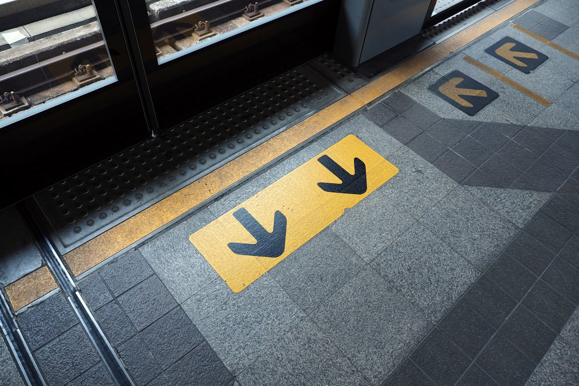
One of the most practical changes you will notice is the increased use of floor-level cues. In many older transit systems, signs are hung high, forcing commuters to look up. This can cause balance issues for those with inner-ear sensitivities or dizziness. The new standard encourages “ground-based” guidance: large, high-visibility floor decals or textured paths that lead directly to elevators, platforms, or exits.
Practical Decision Rule: If you feel unsteady on your feet, avoid navigating by looking up at high-mounted signs while walking. Instead, scan the floor for colored lines or tactile strips. These are specifically designed to be followed while maintaining a neutral, safe posture.
The “Stamina-Aware” Placement
The 2026 standards also dictate that wayfinding information must be placed at “decision points.” A decision point is any location where a traveler must choose a direction (e.g., a fork in a corridor). In older systems, signage is often placed *after* the decision point, leading to backtracking. The new standards mandate that signage must be clearly visible *before* you reach the intersection, allowing you to choose your path and maintain your momentum without unnecessary walking.
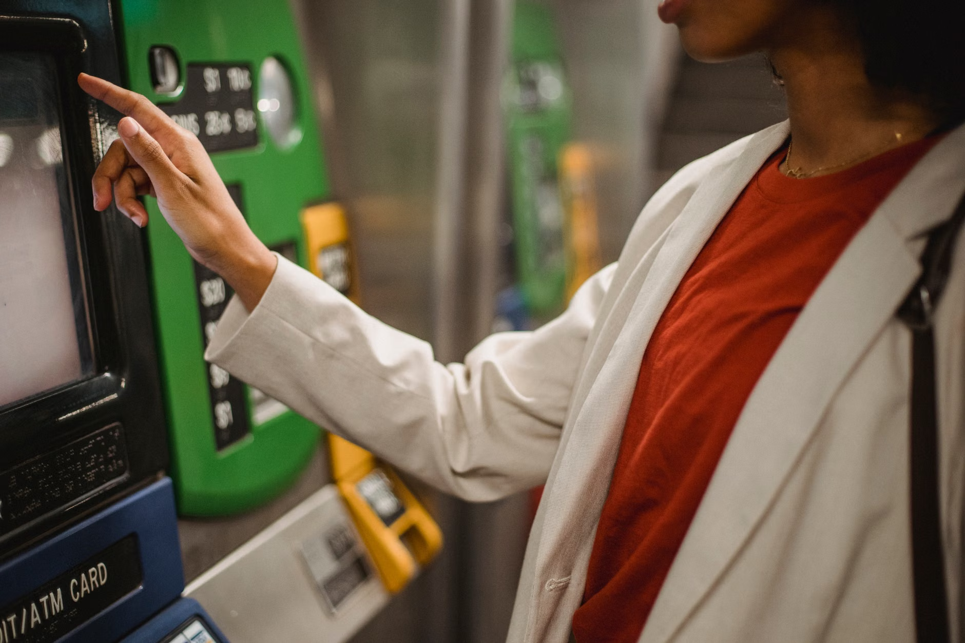
Digital kiosks are becoming the standard for purchasing tickets and finding route information. While these offer speed, they can be intimidating for those who prefer physical interaction. The 2026 standards for digital accessibility ensure that these machines are more than just touchscreens.
Features of the New Digital Standard
- Physical Tactile Controls: Many new kiosks will feature a physical “Home” button or a tactile keypad, providing a reliable way to reset the screen if you get lost in the menu.
- Adjustable Height: Kiosks are being lowered or designed to accommodate individuals using wheelchairs, which also makes them far more comfortable for those who prefer to remain seated or struggle with reaching up.
- Audio-Visual Synchronization: Information displayed on the screen will be accompanied by clear, non-rushed audio cues, helping those who have difficulty reading small, rapidly changing digital text.
What to do if you feel overwhelmed by a digital kiosk: Do not feel pressured by the queue behind you. Modern kiosks under the 2026 guidelines include a “Help” or “Assist” button that triggers a simplified, “high-contrast” mode. This mode strips away advertisements and complex options, leaving only the most common tasks (e.g., “Buy Ticket,” “Find Route”).
Planning Your Journey: A Practical Checklist
Even with the best signage in the world, transit travel requires preparation. Before you head out, use this checklist to ensure your trip remains stress-free.
| Preparation Step | Why It Matters | Action |
|---|---|---|
| Check Station Accessibility | Not all stations are retrofitted yet. | Use official transit apps to check for “step-free access” or “elevator status” before leaving home. |
| Identify “Exit” Landmarks | Large stations can be disorienting. | Note the specific exit number (e.g., “Exit 4”) rather than just the street name. |
| Carry a Physical Backup | Technology can fail or run out of battery. | Print a simple map of your destination station or save a screenshot of the route. |
| Budget Extra Time | Rushing increases the risk of accidents. | Add 15 minutes to your expected travel time to account for slower navigation and rest breaks. |
The table above highlights that while infrastructure is improving, the traveler’s preparation remains the most effective tool for a successful journey. The “extra time” rule is perhaps the most overlooked variable; by removing the pressure to “catch the next train,” you allow yourself the grace to navigate at your own pace, which is the single best way to avoid falls and confusion.
The Hidden Nuance: When Standards Conflict with Reality
While the 2026 global standards provide a necessary framework, it is important to acknowledge that implementation will be gradual. A city might adopt the new signage standards for its bus stops but remain stuck with older, non-compliant signage in its subway tunnels. This “mixed environment” can be more confusing than a system that is entirely old-fashioned.
Insight: Do not assume that because a city is “modern,” every station will be “accessible.” When traveling in a new city, treat the first day as a “scout day.” Take a shorter, low-stakes trip to understand how the signage works in that specific network. If you find the signage confusing, do not hesitate to ask transit staff. Staff training is often updated alongside signage, and they are usually the best resource for navigating the “gaps” between old and new infrastructure.
Addressing Safety Concerns in Transit
If you have concerns about your physical stamina or ability to navigate, remember that transit authorities are increasingly providing “Assistance Services.” These are not just for those with disabilities; they are for any traveler who needs extra time or guidance. Many major transit hubs now offer a “Meet and Assist” service that you can book 24 hours in advance. This service provides a staff member to guide you through the station, help with luggage, and ensure you board your train safely.
Warning Signs: If you find that you are consistently feeling dizzy, overly anxious, or physically exhausted after navigating transit, it may be time to reassess your travel pacing. Prioritize “direct routes” over “cheaper, multi-transfer routes.” While a direct route might cost more, the reduced number of transfers significantly lowers the risk of getting lost or experiencing physical strain.
Conclusion
The 2026 global standards for public transit signage represent a significant leap forward in recognizing the needs of an aging global population. By prioritizing contrast, consistency, and intuitive placement, these standards are helping to ensure that the world of transit remains open and accessible to everyone, regardless of age. As these changes roll out, your best approach is to stay informed, prepare your route in advance, and always prioritize your own comfort and pace over the speed of the crowd.
For more information on accessibility standards in your specific region, refer to your local government’s transportation department website or the International Organization for Standardization (ISO), which provides the foundational documents for these global improvements.
Frequently Asked Questions
1. Will these 2026 standards be applied to every country simultaneously?
No. The 2026 standards serve as a global benchmark or “best practice” guide. Implementation depends on local government budgets, infrastructure upgrade cycles, and regional transit policies. You will likely see these standards appearing in major international transit hubs first, while smaller or older systems may take longer to adapt.
2. Can I trust that “accessible” signage means there will be no stairs?
Generally, yes, but it is wise to verify. The 2026 standards define “accessible” as being free from barriers like stairs or steep inclines. However, in older stations, elevators may occasionally be out of service. Always check the official transit website or app for “elevator status” updates before you depart to ensure your route remains fully accessible.
3. What should I do if I find the signage in a station is confusing or unsafe?
Most transit operators have a “Customer Feedback” or “Accessibility” portal on their website. Providing specific, constructive feedback—such as “The sign for the elevator at Station X is obscured by a pillar”—is highly effective. Transit authorities are actively looking for these “real-world” blind spots as they work to meet the 2026 standards.