Starting in 2026, many nations are adopting updated international standards for tactile walking surface indicators (TWSIs), designed specifically to improve navigation safety for older adults and individuals with visual impairments. These updates move beyond basic “bumps on the ground” to create a standardized, high-contrast language of movement that helps you identify curbs, stairs, and transit platforms with greater confidence and physical stability.
- Enhanced Visibility: 2026 standards mandate higher color contrast ratios, making it easier to distinguish between sidewalk surfaces and hazardous drops even in low-light conditions.
- Standardized Patterns: New global guidelines harmonize the design of “truncated domes” (for warning) and “linear bars” (for directional guidance), reducing confusion when traveling between different cities or countries.
- Trip Prevention: Updated installation requirements focus on flush transitions, ensuring that the indicators themselves do not become tripping hazards—a common issue in older infrastructure.
Understanding Tactile Walking Surface Indicators (TWSIs)
Tactile Walking Surface Indicators, or TWSIs, are the textured surfaces installed on sidewalks, at crosswalks, and near transit stations. Their primary purpose is to provide sensory information through the feet or a mobility aid, such as a cane. By 2026, international bodies such as the International Organization for Standardization (ISO) have refined these requirements to ensure that the physical “language” of our streets is consistent, regardless of where you are traveling.
For adults aged 60 to 80, these indicators are more than just urban design—they are a critical tool for maintaining independence. As we age, our depth perception and ability to quickly adjust to sudden changes in elevation (like a hidden curb) can diminish. TWSIs act as a non-visual warning system that bridges the gap between your physical movement and the environment.
Why the 2026 Updates Matter for Your Daily Routine
Previous standards for tactile indicators often lacked strict enforcement regarding color contrast and installation flushness. In many regions, you may have encountered faded tiles that blended into the concrete or, worse, tiles that were slightly raised, creating a risk of tripping. The 2026 updates address these specific pain points:
- Color Contrast: The new standards require a specific Light Reflectance Value (LRV) difference between the indicator and the surrounding pavement. This ensures that even if your vision is not perfectly sharp, the change in surface is visually obvious.
- Material Durability: Older indicators often cracked or peeled. New material requirements ensure that these surfaces remain intact, reducing the likelihood of loose parts causing a fall.
- Placement Consistency: The distance between the indicator and the actual hazard (the street or the train track) is being standardized to ensure you have enough reaction time to stop before a drop-off.
When you are out for a walk, running errands, or exploring a new city, your focus should be on your destination, not on worrying about the ground beneath your feet. Understanding how these indicators work can change how you navigate.
The Two Main Types of Indicators:
| Indicator Type | Design | Purpose |
|---|---|---|
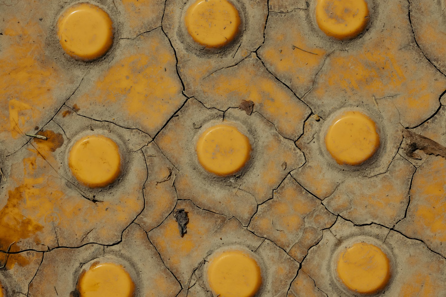
| Warning Indicators | Truncated Domes (small, raised circles) | Alerts you to a hazard, such as the edge of a curb, a street crossing, or a subway platform edge. |
| Directional Indicators | Linear Bars (long, raised ridges) | Provides a path to follow, such as the safest route across a wide, open plaza or toward a transit entrance. |
In real-world application, if you are approaching a crosswalk and feel the “bumpy” texture of truncated domes under your shoes or cane, this is your cue to stop and assess the intersection. If you are in a large, confusing train station and feel the “linear” bars, you can follow them, knowing they are designed to lead you safely toward the gate or the exit without veering into traffic or restricted areas.

What to Look For When You Travel
When visiting a new city, take a moment to observe the ground at the first intersection you encounter. If you see the high-contrast yellow or safety-red tactile tiles, you are likely in an area that prioritizes inclusive mobility. If the ground is uniform in color and texture, you should exercise extra caution, as this indicates that the infrastructure may not meet modern safety standards.
Common Mistake: Many travelers assume that all sidewalks are created equal. In many older European or historic city centers, the paving may be cobblestone or uneven stone, which lacks these tactile indicators entirely. Always check your route for “accessible” or “level” paths, especially if you are using a walker or cane.
The Science of Safety: Why Contrast and Texture are Vital
The 2026 standards are heavily grounded in human factor research. Research suggests that for older adults, the combination of tactile feedback and visual contrast significantly reduces the cognitive load required to navigate complex environments. When you don’t have to spend all your mental energy scanning for potential hazards, you have more stamina for your actual walk or leisure activity.
The Importance of “Flush” Installations
A major focus of the 2026 guidelines is the “flushness” of the installation. If a tactile tile is installed incorrectly, it can create a “lip” or a gap. For those with limited lift in their stride, this is the most common cause of a trip. Modern installation techniques now require these tiles to be integrated into the sidewalk base rather than simply glued on top. When you see a smooth transition from the sidewalk to the tile, you can trust that it is safer to traverse.
How to Advocate for Your Local Environment
If you find that your local sidewalks are outdated or dangerous, you have the right to request improvements from your local municipal government. Because these are now global standards, you can cite them when contacting your local council or public works department.
- Document the Hazard: Take a photo of the area that lacks proper indicators. Note the location and why it is difficult to navigate (e.g., “no warning at this busy intersection”).
- Contact the Right Department: Look for the “Department of Transportation” or “Public Works” in your local government directory.
- Use the Right Language: Use the term “Tactile Walking Surface Indicators” and mention that you are interested in compliance with modern safety standards for senior mobility.
Many cities have dedicated budgets specifically for “Complete Streets” or “Pedestrian Safety” initiatives. By framing your request as a safety and accessibility issue that benefits the entire community, you are more likely to see results.
Common Challenges and How to Manage Them
Even with the best infrastructure, challenges remain. Weather, for example, can impact how these indicators feel and look. During winter months in colder climates, snow or ice can cover these tactile markers. If you live in a region with heavy snowfall, it is vital to rely on secondary cues, such as the sound of traffic or established path markers, rather than relying solely on tactile indicators.
Another challenge is “tactile fatigue.” If you walk long distances, your feet may become less sensitive to the difference in texture. If you are planning a long outing, ensure that you take frequent breaks. Sitting on a bench for five minutes can help reset your physical awareness and provide the rest needed to maintain a steady, safe gait for the remainder of your trip.
Deep Dive: Technical Specifications for the Curious
For those interested in the technical side, the ISO 23599 standard is the primary reference. It dictates not just the shape of the domes, but the spacing between them. The reason for this precision is to ensure that a cane or a shoe tip catches the pattern consistently. If the domes are too far apart, a cane might slide between them; if they are too close, they feel like a smooth surface. The 2026 update optimizes this spacing for the average stride length of an older adult, ensuring that the warning signal is unmistakable.
Furthermore, the material requirements are being upgraded to include “slip-resistance” ratings. A common issue with older plastic or metal tiles was that they became incredibly slippery when wet. The new standards mandate a coefficient of friction that ensures your shoe grip is maintained, even in rainy or snowy conditions. This is a massive improvement for those who walk in varied climates.
Staying Informed: Resources for Continued Learning
To stay updated on how your country is implementing these standards, you can check the following resources:
- The International Organization for Standardization (ISO): Search for “ISO 23599” to read about the global standards for assistive products for blind and low-vision persons. https://www.iso.org
- Local Disability Advocacy Groups: Often, these organizations have the most up-to-date information on local infrastructure projects that are currently under construction or planned for the coming year.
- Municipal Planning Portals: Most major cities publish their “Pedestrian Master Plan” online. These documents will explicitly state if they are upgrading their sidewalks to meet 2026 standards.
Conclusion: A More Accessible Future
The 2026 updates to global sidewalk standards represent a significant shift toward a more inclusive urban environment. By prioritizing clear, high-contrast, and consistent tactile feedback, cities are acknowledging that mobility is a lifelong right. For you, this means safer walks, more predictable navigation, and the peace of mind that comes with knowing the ground you walk on is designed with your safety in mind.
As these standards are implemented, take the time to notice the changes in your local neighborhood. Understanding these tools is the first step toward using them to your advantage. Whether you are walking to the grocery store or traveling to a new destination, these small, textured indicators are your silent partners in ensuring a safe and independent journey.
Frequently Asked Questions
1. Will these new tactile indicators make walking more difficult for those with balance issues?
No. When installed correctly according to the 2026 standards, these indicators are flush with the sidewalk. They are designed to be easily detectable by a cane or through the sole of a shoe, but they should not create a tripping hazard. If you encounter an indicator that feels like a significant bump or obstacle, it may be improperly installed and should be reported to your local public works department.
2. Are these standards mandatory for every country?
ISO standards are international guidelines. While they are not automatically local law, most developed nations adopt them into their own national building codes. You can check your national building code website or your city’s transportation department website to see if they have adopted the latest ISO 23599 guidelines for 2026.
3. Can I use these indicators if I don’t have a visual impairment?
Absolutely. These indicators are designed for everyone. While they are crucial for those with visual impairments, they provide a secondary layer of safety for all pedestrians, especially in low-light conditions or busy intersections where it is easy to become distracted. Think of them as a “tactile alert” that helps everyone stay aware of their surroundings.