Key Takeaways
- New Global Benchmarks: By 2026, many international transit hubs and public facilities will adopt upgraded signage standards to improve contrast, font size, and placement specifically for aging eyes.
- Beyond Visuals: The new standards emphasize “wayfinding” rather than just static signs, integrating audio, tactile elements, and digital accessibility to ensure independence.
- Practical Empowerment: Understanding these standards helps you navigate public spaces more confidently and allows you to advocate for better accessibility in your local community.
Navigation in public spaces—from airports and hospitals to government offices and transit centers—is a fundamental component of maintaining personal independence as we age. As global populations shift, international bodies such as the International Organization for Standardization (ISO) and various regional transport authorities are finalizing a new set of guidelines for 2026. These standards aim to standardize how information is presented to ensure it remains legible and useful for older adults, regardless of varying levels of visual acuity or cognitive processing speed.
This article explores what these 2026 standards entail, why they are being implemented, and how they will change the way you interact with the world around you.
1. The Core Philosophy of the 2026 Standards
Historically, signage has been designed with a “one-size-fits-all” approach, often overlooking the physiological changes that occur with age, such as decreased contrast sensitivity, reduced field of vision, and the need for longer processing times. The 2026 standards shift the paradigm from “universal design” to “age-inclusive design.”
What it is: The new standards prioritize legibility through high-contrast color palettes, specific font weights (sans-serif), and, crucially, consistent placement. Instead of placing signs at varying heights, the 2026 guidelines suggest a “zone of visibility” between 120cm and 160cm from the floor.
Why it matters: When signage is placed too high or too low, it forces the neck into uncomfortable positions, which can be difficult for those with limited mobility. Furthermore, standardizing the height means you will know exactly where to look for information, reducing the cognitive load of searching for signs in unfamiliar environments.
Real-life impact: Imagine arriving at a large, bustling train station. Instead of scanning the walls in panic to find the platform number, the new standards ensure that the primary directional signs are placed at a consistent eye level, using high-contrast yellow-on-black or white-on-dark-blue color schemes, which have been proven to be the most legible for people with cataracts or macular degeneration.
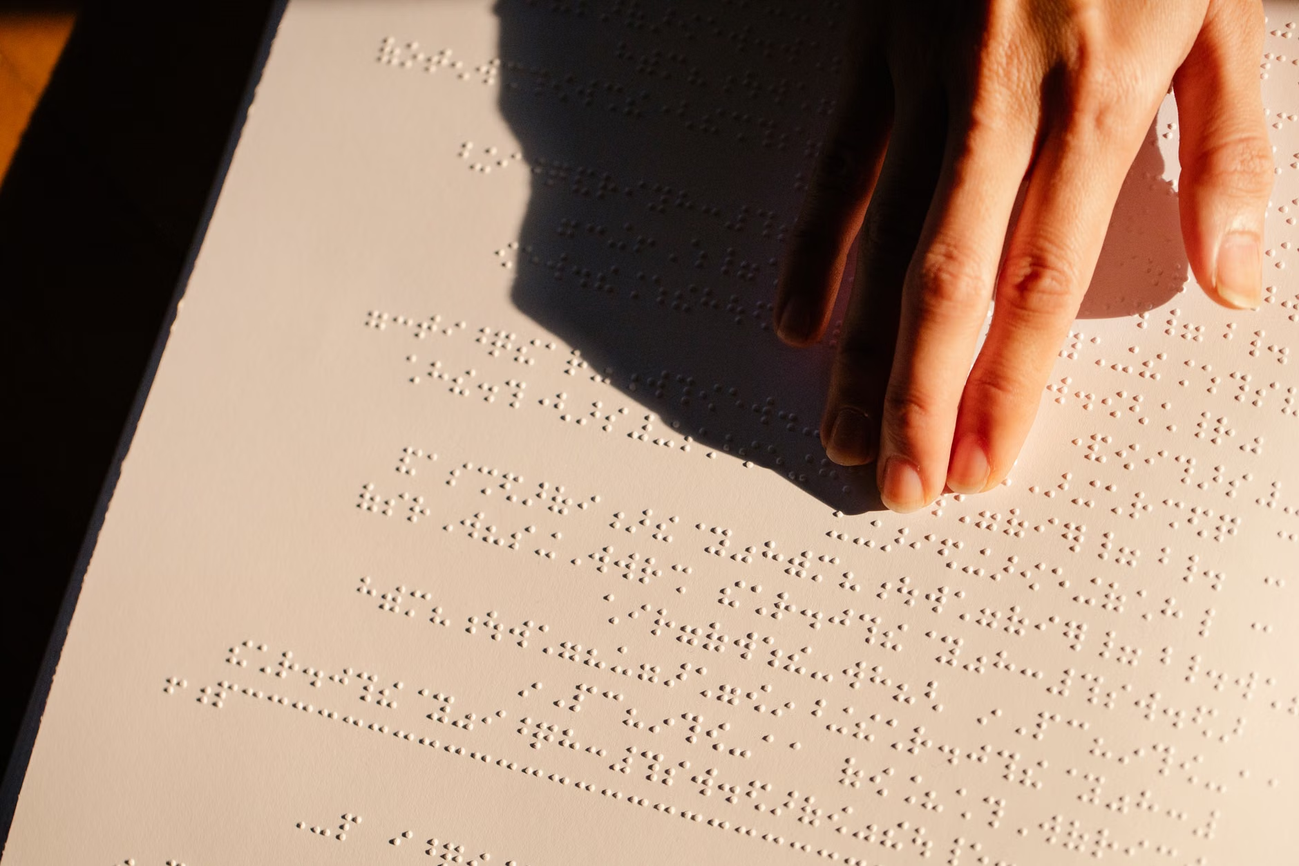
2. Technical Requirements for Legibility and Contrast
One of the most significant changes coming in 2026 involves the technical specifications for typography and lighting. Research shows that as we reach our 60s, 70s, and 80s, our eyes require significantly more light to perceive the same level of detail as a younger person. The 2026 standards address this through mandatory “luminance contrast” levels.
The Luminance Contrast Rule
Luminance contrast refers to the difference in light reflected between the text and the background. The new standards require a minimum contrast ratio of 70%. To put this into perspective, white text on a light gray background would fail this test, whereas white text on a dark navy or black background would easily pass.
| Feature | Old Standard (General) | 2026 Global Standard |
|---|---|---|
| Font Type | Variable | Strictly sans-serif (e.g., Arial, Helvetica) |
| Contrast Ratio | Often insufficient | Minimum 70% luminance contrast |
| Placement | Varies by wall space | Consistent 120cm–160cm height |
| Finishes | Glossy (causes glare) | Matte/Non-reflective |
What the reader can do: When visiting public buildings, look for these features. If you find that a facility is difficult to navigate due to glare or small text, you are now equipped with the knowledge that these are not personal failings, but rather design deficiencies. You can provide feedback to facility managers by specifically mentioning the “lack of luminance contrast” or “inconsistent placement,” which are terms that align with the new 2026 global framework.
3. Wayfinding: Moving Beyond Just “Signs”
The 2026 standards move away from the concept of a single sign and toward “wayfinding systems.” A wayfinding system includes the path, the floor markings, the lighting, and the digital assistance provided during a journey.
What it looks like: In many international airports, we are already seeing the introduction of “pathfinding floors.” These are color-coded lines on the floor that lead directly from the entrance to specific gates or baggage claims. The 2026 standards refine this by requiring that these lines be textured, providing tactile feedback for those who use canes or have limited vision.
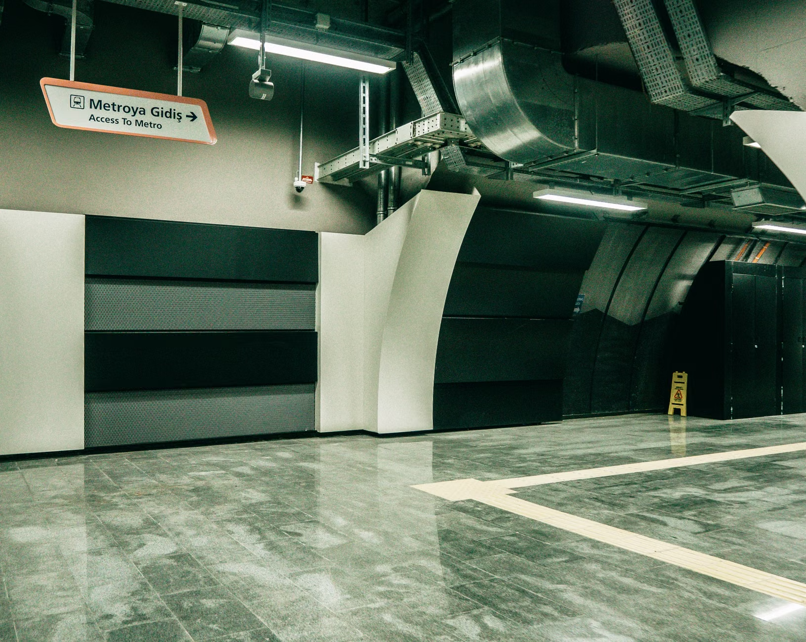
The Role of Digital Integration: Perhaps the most exciting development is the push for “digital-physical hybrids.” This involves QR codes or NFC (Near Field Communication) tags placed on physical signs. When scanned with your smartphone, these tags can provide audio instructions, larger text versions of the sign, or even a live map of your current location. This is particularly helpful in complex environments like large hospitals where signs can be overwhelmed by too much information.
How to use Digital Assistance
- Identify the Icon: Look for the universal “accessibility” symbol or a smartphone icon on physical signs.
- Scan: Use your phone’s camera to scan the QR code.
- Navigate: Follow the audio prompts or visual maps provided on your screen.
4. Implementation and Jurisdiction: Where and When?
It is important to understand that “Global Standards” are not laws that automatically apply to every building in every country. Instead, they are recommendations that national governments adopt into their own building codes. For example, the European Union is likely to adopt these standards via the European Accessibility Act, while North American standards will be integrated into the Americans with Disabilities Act (ADA) updates.
Important Distinction: If you are traveling, be aware that implementation will be staggered. Major international hubs (e.g., London Heathrow, Singapore Changi, Tokyo Haneda) are often the first to upgrade. In smaller, rural, or older municipal buildings, these changes may take several years to fully implement.
What this means for your travel: When planning a trip, do not assume every destination is fully compliant. If you rely on specific signage for navigation, check the official website of the transit authority or venue. Many now have an “Accessibility” section that outlines their current signage and navigation support.

5. Overcoming Hidden Inconveniences
While these new standards are a major step forward, there are still “hidden” variables that even the best signage cannot solve. One such variable is “signage fatigue.” Even with perfect, high-contrast signs, being in a busy, noisy environment can be overwhelming.
The Trade-off: The more information that is added to a sign to make it “inclusive,” the more cluttered it can become. The 2026 standards aim to solve this by advocating for “minimalist information.” This means signs should only display the most critical information (e.g., “Exit,” “Restroom,” “Platform”) and leave secondary information (e.g., historical plaques, advertisements) for other areas.
A Practical Tip for the Reader: If you find yourself in a space that is poorly designed, prioritize “landmark navigation.” Instead of looking for signs, identify permanent, unique features in the architecture—a specific sculpture, a change in flooring material, or a unique lighting fixture. Landmarks are often easier to remember and identify than reading text, especially when you are tired or in a hurry.
6. Preparing for Your Next Journey
As these standards roll out, you can take proactive steps to ensure your comfort while traveling or navigating your own city. Preparation is the key to maintaining your autonomy.
Checklist for Navigating New Environments:
- Pre-trip Research: Use Google Maps or similar services to look at “Street View” images of an entrance or station. This helps you familiarize yourself with the environment before you arrive.
- Identify Support Points: Most major stations have an “Assistance Point.” Know where this is located before you enter the building.
- Carry a Magnifier or Use Your Phone: Even with improved signage, having a portable magnifying glass or a high-contrast setting on your smartphone (e.g., “Magnifier” app on iOS or “Accessibility Menu” on Android) is a great safety net.
- Know Your Rights: In many jurisdictions, you have the right to request assistance. Do not hesitate to ask staff for help if the signage is unclear or if you are feeling disoriented.
7. The Future of Age-Inclusive Environments
The 2026 standards are just the beginning. The shift toward inclusive design is a global trend that recognizes that accessibility is not a “special service” for a minority, but a necessity for everyone. As we age, our interaction with the physical environment changes, and our infrastructure must adapt to support our continued engagement with the world.
By staying informed about these changes, you are not just a passive user of public services; you are an informed consumer. Your feedback to local councils and transport authorities—when based on recognized standards—is a powerful tool for driving change in your own community.
Conclusion: The 2026 standards for age-inclusive signage represent a shift toward a more navigable and safer world for everyone. By understanding the importance of contrast, consistent placement, and digital-physical integration, you can navigate public spaces with greater confidence and ease. Remember to prioritize your own comfort, use available digital tools, and advocate for the standards that make travel and public life accessible for all.
Frequently Asked Questions
1. Will these 2026 standards apply to every building immediately?
No. The 2026 standards are being adopted as guidelines, and implementation will vary by country and region. Major international transit hubs will likely lead the way, while smaller, private, or older buildings may take longer to update their signage. Always check the accessibility features of a venue in advance if you have specific navigation needs.
2. What should I do if a public space is difficult to navigate due to poor signage?
You can provide constructive feedback to the facility manager. Use specific terminology such as “lack of luminance contrast,” “inconsistent sign placement,” or “excessive visual clutter.” Mentioning that you are aware of the upcoming 2026 global standards can add weight to your request for improvements.
3. Are digital maps replacing physical signs?
Not entirely. The 2026 standards view digital tools as a supplement to physical signage, not a total replacement. The goal is a “hybrid” approach where you can use whichever method—physical signs or digital assistance—is most comfortable and effective for you in that specific moment.
For further information on global accessibility standards, you can visit the International Organization for Standardization (ISO) or your country’s national accessibility authority, such as the U.S. Access Board.